Choosing Authentic Heritage Paint Colours for Period Rooms
By Eleanor Vance (MA Architectural Conservation (Courtauld) | SPAB Member | IHBC Affiliate) | October 22, 2026 | 9 min read
Editorial & Affiliate Disclosure: LUMAA HOME is reader-supported. Our editors independently research, test, and specify every material and product featured. When you purchase through retailer links on our site, we may earn an affiliate commission at no extra cost to you, in accordance with UK ASA guidelines.
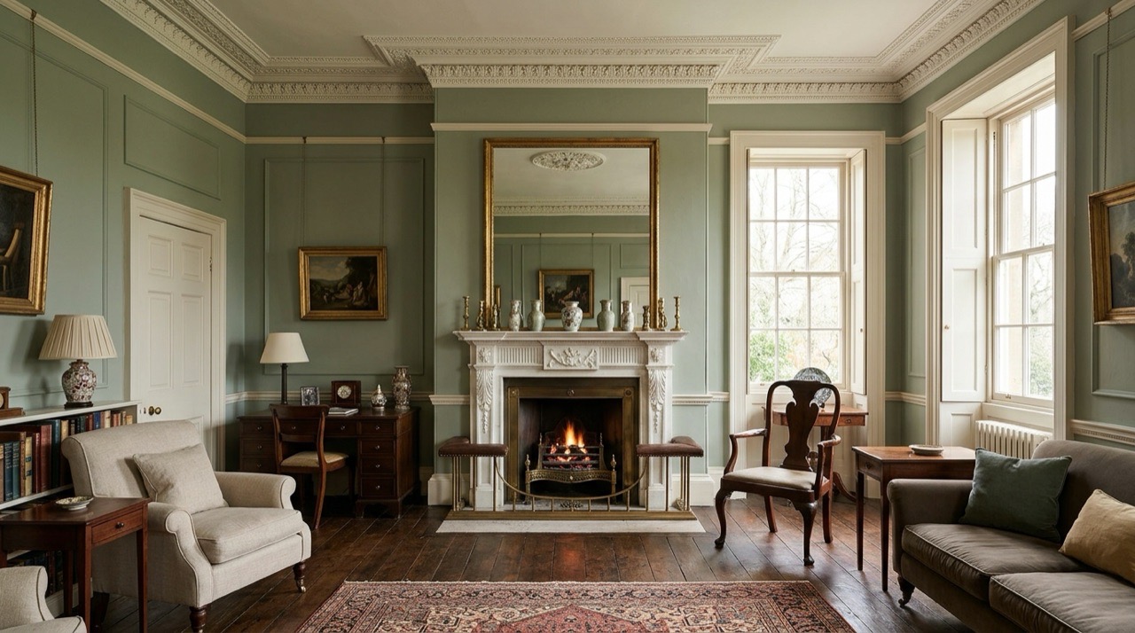
Why Heritage Shades Look Different from Modern Paint
Brilliant white emulsion looks stark and cold inside an older property. On uneven historic plaster, high-sheen synthetic white throws hard shadows across every bump, turning a quiet sitting room chilly and exposing minor surface flaws.
Old rooms sit much better with heritage paint colours made from natural earth pigments like yellow ochre, raw umber, red iron oxide and burnt sienna. These pigments do not bounce light back like modern titanium dioxide bases. They absorb and scatter daylight across the wall, giving plaster an earthy, muted depth that alters as the sun moves across the sky.
Today you can choose from ranges like dulux heritage paint colours, crown heritage paint colours, archival cards from Little Greene and traditional heritage paint colours farrow and ball collections. Getting the right heritage paint colours uk homeowners want means looking at how your room faces the sun, how much daily wear the walls take and whether your exterior walls need breathable mineral paint.
Modern trade emulsions use chemical brighteners and pure white bases. Historic paint formulas rely on ground minerals that behave completely differently inside a home.
Soft Chalky Finish Instead of Plastic Sheen
Standard retail vinyl emulsion leaves a faint rubbery sheen when daylight hits the wall from an angle. Historic paint dries dead flat, usually carrying no more than 2% or 3% sheen. That chalky surface scatters natural daylight in every direction. If your room has old lime plaster, repaired settlement cracks or wavy walls, a dead flat finish disguises every lump and keeps the room quiet to the eye. If planning bright neutral daylight across a studio or hobby room instead, check our workshop setup notes on creating a collaborative DIY art studio.
How Natural Daylight Changes the Colour in Your Room
Traditional english heritage paint colours mix multiple mineral pigments into a single tin. Because of that complex mix, the wall reacts to every shift in weather. A soft off-white can look pale and fresh under morning sun, take on a cool greenish cast around midday and settle into a buttery cream by late evening under warm table lamps. You get depth without needing loud accent walls or glossy feature wallpaper.
Picking Colours by House Style and Age
Every period of British building used distinct palettes shaped by local materials and architectural proportions.
Georgian Homes: Light Muted Stones and Soft Sage Greens
Builders between 1714 and 1837 prioritized tall proportions, symmetrical layouts and tall sliding sash windows. Homeowners favored pale, quiet tones that let daylight travel deep into rooms. Pale stone, straw yellow, soft sage green, quiet olive and muted sky blue were standard choices. Skirting boards and architraves were never painted stark white. Decorators used stone off-whites tinted with a splash of the wall color so the joinery eased into the plaster.
Victorian Terraces: Rich Terracotta, Deep Navy and Dark Green
Victorian properties built between 1837 and 1901 leaned toward saturated, heavy shades. Industrial mills made pigments affordable, while gas lamps and coal fireplaces suited deeper tones. Parlours, hallways and dining rooms took rich terracotta, dark hunter green, navy blue, plum and chocolate brown. Skirting boards and four-panel doors were painted dark to match the walls or given dark brown varnish to resist scuffs from soot and dirty boots.
Edwardian Rooms: Bright Pastels and Sunny Neutrals
Edwardian homes from 1901 onward rejected heavy Victorian darks. Builders put in wide hallways and generous casement windows to pull in light and garden views. Decorators switched to light tones: primrose yellow, duck egg blue, soft dove grey, pale lilac and warm ivory. These shades make morning rooms, bedrooms and kitchens feel airy throughout long British winters.
Solving Common Lighting Problems in Older Rooms
Your window exposure dictates how pigments perform inside a room. Picking a shade without checking your daylight leads to dingy walls or overwhelming glare.
Cold North-Facing Rooms: Using Yellow and Red Bases to Add Warmth
North-facing windows pull in weak, blue-tinted daylight that stays flat all afternoon. Cool greys and bright whites look freezing in these spaces. Counter that cold cast with paints carrying a yellow, red or peach undertone. Buff stone, biscuit, muted terracotta and warm cream turn weak northern light into an inviting glow that keeps living rooms comfortable.
Sunny South-Facing Rooms: Using Cool Greys and Greens to Soften Glare
South-facing rooms receive bright, golden sunshine from mid-morning to sunset. Warm cream paints can turn garish yellow in this strong light. Balance that intense sun with cool tones. Muted sage green, French grey, chalky slate blue and soft stone absorb bright sun and create a calm retreat during midsummer heat.
Dark Hallways and Stairs: Light Without Glare
Terraced hallways often have no direct windows, relying entirely on light leaking through fanlights and open interior doors. Brilliant white looks clinical here. Choose a pale stone, parchment or putty tone with high light reflection. These shades brighten long corridors without glaring under electric pendant bulbs.
Choosing the Right Finish for Walls, Skirting and Doors
Every surface in an old home demands a finish matched to its daily wear.
Living Rooms and Ceilings: Soft Chalky Matt
Dead flat emulsion under 3% sheen belongs on ceilings, drawing rooms and bedrooms. It gives an authentic chalky look that swallows glare and conceals bumps in old plaster. Keep it away from sticky fingers, as scrubbing traditional flat paint leaves shiny burnish marks.
Kitchens and Hallways: Washable Matt That Wipes Clean
High-traffic hallways, staircases and family kitchens take regular grease, mud and scuffs. Traditional flat paint stains easily, but modern scrubbable mattes like Dulux Heritage Velvet Matt and Little Greene Intelligent Matt wipe clean with a wet cloth and warm soapy water without losing their flat look.
Woodwork, Skirting Boards and Doors: Durable Eggshell
Baseboards take constant hits from vacuum cleaners, shoes and pets. Paint skirting boards, door frames, window sills and panel doors with an eggshell finish carrying 15% to 20% sheen. Eggshell resists knocks, wipes down easily and provides a traditional soft satin glow.
How the Major Paint Brands Compare for Everyday Homes
Paint makers target different budgets and surface requirements across the UK.
| Brand | Historic Collection | Typical Finishes | Washability | Best Use in the Home |
|---|---|---|---|---|
| Farrow and Ball | 132 classic shades | Estate Emulsion, Modern Emulsion, Eggshell | Moderate in Estate; Good in Modern | Bedrooms, ceilings and formal living spaces |
| Little Greene | Historic archival and National Trust palettes | Absolute Matt, Intelligent Matt, Eggshell | High in Intelligent range | Period restorations and high-pigment feature walls |
| Dulux Heritage | 112 historic shades | Velvet Matt, Durable Eggshell | Very high washability | Busy family homes, hallways and kitchens |
| Crown Heritage | Classic British period shades | Flat Matt, Clean Extreme Eggshell | High durability trade options | Rental renovations and budget-friendly projects |
| Earthborn | Clay and breathable mineral paints | Claypaint, Eco Eggshell | Breathable wipe-clean finish | Old lime plaster, cottages and historic brickwork |
Farrow and Ball: Chalky Finish and Classic Heritage Names
Farrow and Ball built its reputation on historic shades like Cornforth White, French Gray, Pigeon and Hague Blue. Their Estate Emulsion offers an authentic powdery texture ideal for low-wear reception rooms. For kitchens and bathrooms, their Modern Emulsion provides a durable wipeable resin base.
Little Greene: Deep Pigment and National Trust Palettes
Little Greene partners with the National Trust to reproduce authentic shades documented in historic country estates. Their formulas carry dense pigment loads that yield rich coverage in two coats. Their Intelligent Matt range wipes clean with water, making it dependable for busy households with young children.
Dulux Heritage and Crown: Hard-Wearing and Budget-Friendly Options
Dulux Heritage supplies 112 historic shades formulated for modern scrubbing. It costs about a third less than boutique designer brands and stands up to wet sponge cleaning. Crown Heritage delivers period palettes in trade-grade emulsions that keep decorating costs sensible across large renovations.
Painting Exterior Brick and Stone Without Damaging the Walls
Applying heritage paint colours exterior walls on pre-1919 houses requires strict attention to wall breathability.
The Problem with Standard Masonry Paint on Old Walls
Retail masonry paints dry into a flexible plastic film across the brickwork. On modern cavity walls with damp courses, that waterproof skin causes no trouble. On historic solid brick, stone or cob walls, plastic coatings trigger serious damp decay.
Old walls manage water by breathing. They take in small amounts of driving rain and let it evaporate through open pores in the masonry and lime mortar. A plastic paint traps that moisture inside the brick. When winter temperatures drop below freezing, trapped water turns to ice, expands and blows the face off old brickwork while pushing the paint away in damp bubbles.
Breathable Paints That Let Moisture Dry Out
Historic exteriors need mineral silicate paints or traditional limewash tinted with lime-fast earth pigments. Silicate paints soak directly into porous stone and lime render, forming a chemical bond without building an impermeable skin. Water vapour passes out freely, keeping the solid wall dry and preserving soft period brickwork.
The Best Way to Test Paint Samples on Your Walls
Never choose a shade from a glossy paper card or a phone display. Printing inks cannot replicate how natural pigments react to British weather.
Why You Should Paint Cardboard Instead of the Wall
Painting test patches straight onto an existing wall leads to mistakes. The old paint color skews your perception of the new sample. Roll two coats of sample paint onto large white lining paper or cardboard, leaving a two-inch white margin around the edge. That clean white frame lets your eyes evaluate the undertone cleanly.
Checking the Sample Under Morning Sun and Evening Lamps
Move the painted board around your room across the day. Set it beside the window in morning light, shift it into a shadowy corner by afternoon and prop it against the skirting board after sunset. Evening light alters pigment warmth. Investing in layering living room lighting with warm 2700K floor and table lamps brings out the true depth of your walls without harsh overhead glare. Testing your sample under day and night lighting keeps you from buying full tins of a shade that turns murky once the sun sets.
Frequently Asked Questions
Which heritage colours are most popular in UK homes?
Soft sage greens and warm stone neutrals lead UK sales. Common favorites include French Gray, Pigeon, deep navy tones like Hague Blue and warm off-whites like Pointing or Shirting.
Can flat chalky paint be washed without leaving marks?
Standard chalky paint burnishes and leaves shiny spots if scrubbed. If you have children or pets, pick durable matte formulas like Dulux Heritage Velvet Matt or Little Greene Intelligent Matt, which wipe clean using warm water and mild soap.
Why do heritage brands cost more than standard trade paint?
Heritage paint manufacturers use higher ratios of finely ground natural pigments without cheap chalk or clay fillers. This dense pigment mix provides deeper light absorption and superior coverage, reducing the number of coats required.
Did Georgian and Victorian painters use pure white on doors and woodwork?
No, bright brilliant white was not invented until the 20th century. Georgian and Victorian decorators used off-whites tinted with umber or wall pigment, or painted trim in deep greens and browns to disguise scuffs.
Can modern masonry paint go onto old stone or lime render?
Never apply standard vinyl or acrylic masonry paint to solid brick or stone walls built before 1919. It traps moisture inside the masonry and causes frost spalling. Always use breathable silicate paint or limewash.
What paint finish works best on cast-iron radiators?
Standard emulsion will crack and flake when heating pipes expand. Use an acrylic eggshell formulated for interior wood and metal, or a specialist metal paint that tolerates temperature swings without yellowing.